
Styleguide
Typography
This paragraph uses the large paragraph styling and is designed to be around three lines on larger screens. It should introduce what the page is about so users know if the page is relevant to their needs. Lorem ipsum dolor sit amet, consectetur adipiscing elit. Duis ut placerat eros, in ultrices ipsum.
This is a standard paragraph, which allows for longer form content to further explain items. Lorem ipsum dolor sit amet, consectetur adipiscing elit. Mauris eu risus sit amet augue laoreet ultrices. In hac habitasse platea dictumst. Phasellus tristique odio quis sapien sodales iaculis. Vestibulum at varius ipsum, non volutpat ex. Nullam odio enim, tristique a est vel, pellentesque pretium mauris. Sed efficitur ornare tortor et pharetra. Pellentesque rutrum arcu id massa vulputate consequat. Pellentesque habitant morbi tristique senectus et netus et malesuada fames ac turpis egestas. Duis a dictum odio, quis cursus tellus. Nunc mattis urna nec felis tincidunt tempus. Aenean lacinia semper quam eu molestie. Etiam lacinia purus nec tempus pretium.
The smallest paragraph style, used for disclaimers and footnotes. Lorem ipsum dolor sit amet, consectetur adipiscing elit. Duis ut placerat eros, in ultrices ipsum. Quisque quis augue dolor. In semper rutrum nisi, nec vehicula ipsum.
Page Title
Lorem ipsum dolor sit amet, consectetur adipiscing elit. Mauris eu risus sit amet augue laoreet ultrices. In hac habitasse platea dictumst. Phasellus tristique odio quis sapien sodales iaculis. Vestibulum at varius ipsum, non volutpat ex. Nullam odio enim, tristique a est vel, pellentesque pretium mauris. Sed efficitur ornare tortor et pharetra. Pellentesque rutrum arcu id massa vulputate consequat. Pellentesque habitant morbi tristique senectus et netus et malesuada fames ac turpis egestas. Duis a dictum odio, quis cursus tellus. Nunc mattis urna nec felis tincidunt tempus. Aenean lacinia semper quam eu molestie. Etiam lacinia purus nec tempus pretium.
Heading
Lorem ipsum dolor sit amet, consectetur adipiscing elit. Mauris eu risus sit amet augue laoreet ultrices. In hac habitasse platea dictumst. Phasellus tristique odio quis sapien sodales iaculis. Vestibulum at varius ipsum, non volutpat ex. Nullam odio enim, tristique a est vel, pellentesque pretium mauris. Sed efficitur ornare tortor et pharetra. Pellentesque rutrum arcu id massa vulputate consequat. Pellentesque habitant morbi tristique senectus et netus et malesuada fames ac turpis egestas. Duis a dictum odio, quis cursus tellus. Nunc mattis urna nec felis tincidunt tempus. Aenean lacinia semper quam eu molestie. Etiam lacinia purus nec tempus pretium.
Subheading
Lorem ipsum dolor sit amet, consectetur adipiscing elit. Mauris eu risus sit amet augue laoreet ultrices. In hac habitasse platea dictumst. Phasellus tristique odio quis sapien sodales iaculis. Vestibulum at varius ipsum, non volutpat ex. Nullam odio enim, tristique a est vel, pellentesque pretium mauris. Sed efficitur ornare tortor et pharetra. Pellentesque rutrum arcu id massa vulputate consequat. Pellentesque habitant morbi tristique senectus et netus et malesuada fames ac turpis egestas. Duis a dictum odio, quis cursus tellus. Nunc mattis urna nec felis tincidunt tempus. Aenean lacinia semper quam eu molestie. Etiam lacinia purus nec tempus pretium.
Call to action & Labels
Lists
Unordered list – this is for lists where the order of the items doesn’t matter. If the order of the items in the list matters, you should use a numbered list instead.
- Lorem ipsum dolor sit amet, consectetur adipiscing elit.
- Mauris eu risus sit amet augue laoreet ultrices.
- In hac habitasse platea dictumst.
- Phasellus tristique odio quis sapien sodales iaculis.
- Sed efficitur ornare tortor et pharetra.
- Pellentesque rutrum arcu id massa vulputate consequat.
Styling for a numbered list. The order of the items matters in these.
- Lorem ipsum dolor sit amet, consectetur adipiscing elit.
- Mauris eu risus sit amet augue laoreet ultrices.
- In hac habitasse platea dictumst.
- Phasellus tristique odio quis sapien sodales iaculis.
- Sed efficitur ornare tortor et pharetra.
- Pellentesque rutrum arcu id massa vulputate consequat.
Blockquotes
Blockquotes are separate to testimonials, in that they don’t have images behind them and are written directly into the page. This means they should be reserved for very specific use cases, such as for the school motto.
Lorem ipsum dolor sit amet, consectetur adipiscing elit. Aliquam imperdiet risus at convallis congue. Nulla vulputate aliquam libero sed feugiat. Nam sollicitudin nulla et libero pretium.
Firstname, Year 12

Sections
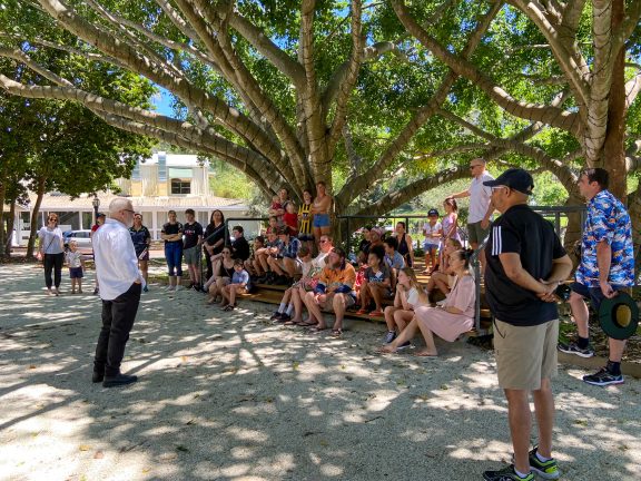
To break up a page into different areas, we can use images, or section colours to aid in that transition. This is an example of a section block with an image placed into the background. The text will automatically change to appear white on the front end to keep the text readable over top.
Light Grey
This is an example of using a light grey background. We can place many things in here, including FAQs, or cards.
Cards & Tiles
Cards and tiles are used to link to other pages and dynamically bring through certain elements.
Cards
Add the “Cards” block and select the pages to feature. This will dynamically pull through the featured image, excerpt and title of the pages featured. The advantage here is that if the page title or excerpt is updated, it will update across the website wherever it is featured.
-
Community
Faith Christian School of Distance Education is made up of a hardworking team of over 140 staff, a parent-run Board and a school community of over 1500 people.
-

Enrolments
Faith Christian School offers more than distance education our school equips families to Achieve Through Christ.
-
About Us
Faith Christian School of Distance Education is made up of a hardworking team of over 140 staff, a parent-run Board […]
Photo Tile Grid
Add these using the “Photo Tile Grid” block. These are designed to link to pages in a similar way to cards, but without the additional excerpt. This is helpful for creating some variance in a page if it’s quite long, or if there are many pages to link to.
Square Style


Rectangular Feature Style
This variant displays the top two cards at a larger size, with the remaining pages falling into the grid.
Coloured Tiles
Add these using the “Coloured Tiles” block. These are currently only used on the home page, however they can be used on other pages as well. They are helpful if you have 4 or 8 pages to link as they can display in a compact grid. These have unique descriptions and titles, so they can be curated to be shorter, so these don’t update dynamically if the title of the page they link to changes.
FAQs
These are pulled through dynamically by category. To display FAQs on a page, add the “FAQs” block and select the relevant category in the block options. These display in an interactive accordion format, so the user can easily scan through the available questions and then click to reveal the answer.
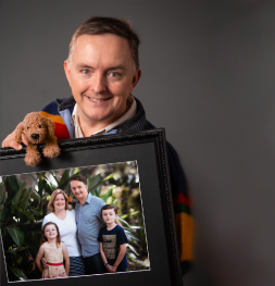
Testimonials
To display a visual testimonial slider on a page, select the “Testimonial Slider” block and choose what category of testimonials to display. When new testimonials are added to this category, the slider on the page will automatically update to display the newer testimonials, which keeps the content fresh.
The testimonial slider is useful fo breaking up large screens of text as well, to give some visual interest to the page.
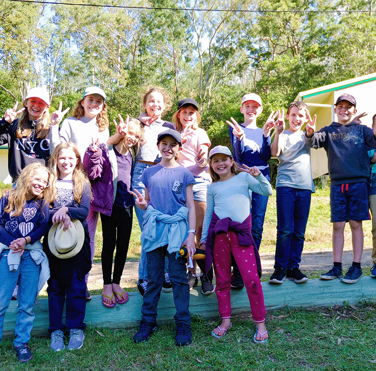
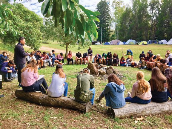
“The Adventurer’s Guide to Noosa Camp was a great atmosphere, uplifting mood. One of the better camps I’ve been on.” Pieter Esterhuysen, Faith Student
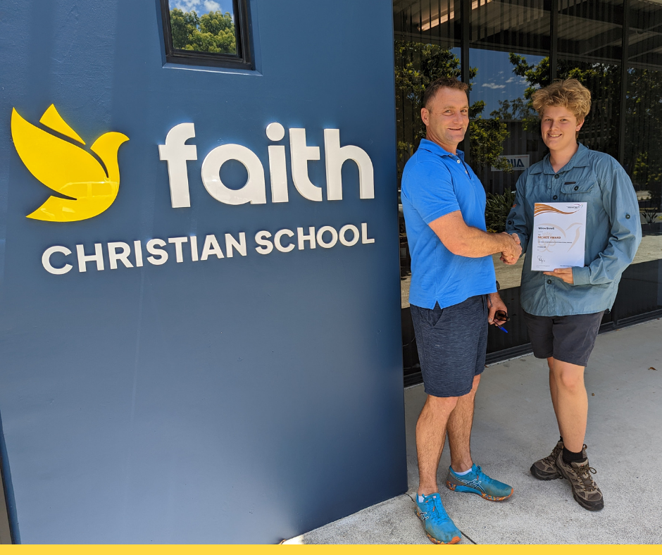
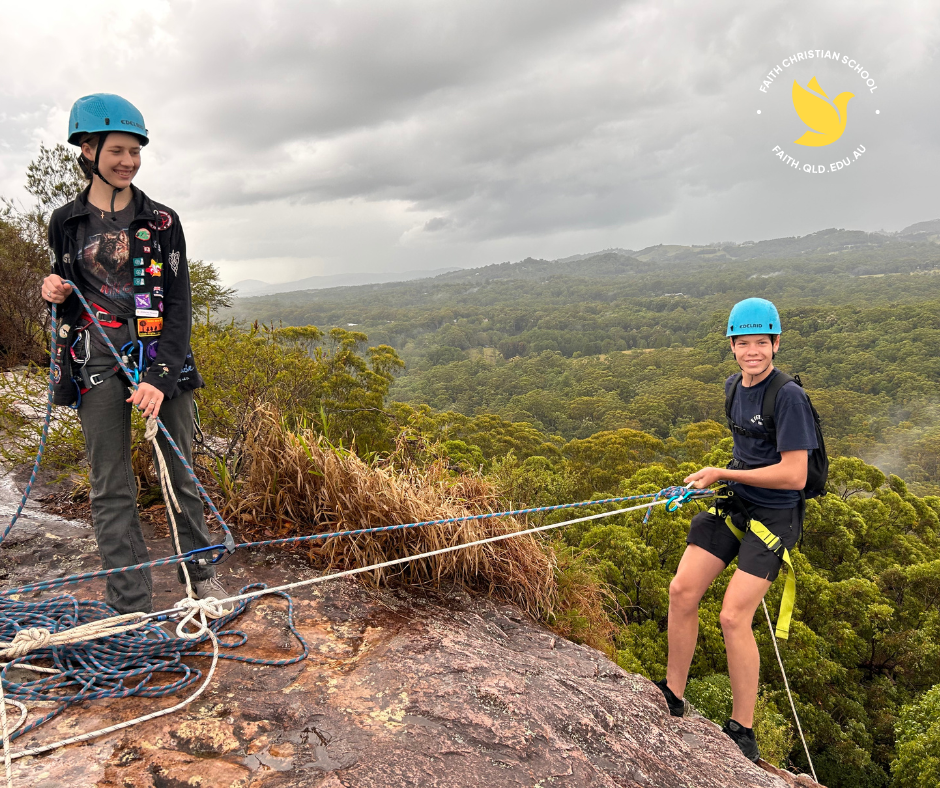
“The best part of Duke of Ed is the Camps. I highly recommend Duke of Ed as you learn a lot about all different people and yourself.” Willow Bonett, Faith Student
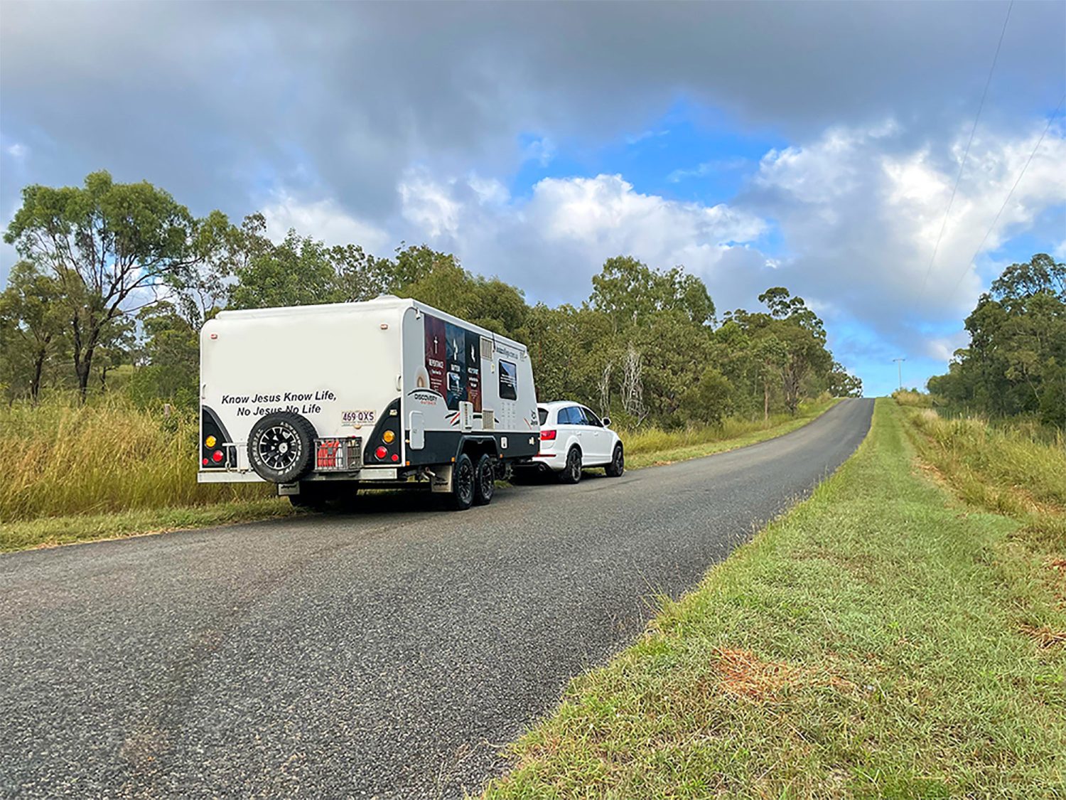
Faith has been an absolute blessing for us as a family, enabling us to take our kids out of 9 to 3 school and bring them with us in our caravan to learn as we journey and travel together as a family on a mission for Christ. We’ve been able to incorporate the learning in the curriculum into our day-to-day living and in the places that we are exploring as we go. It’s flexible, it’s wonderful, and we encourage anyone to join! Sulata Pop, Faith Parent
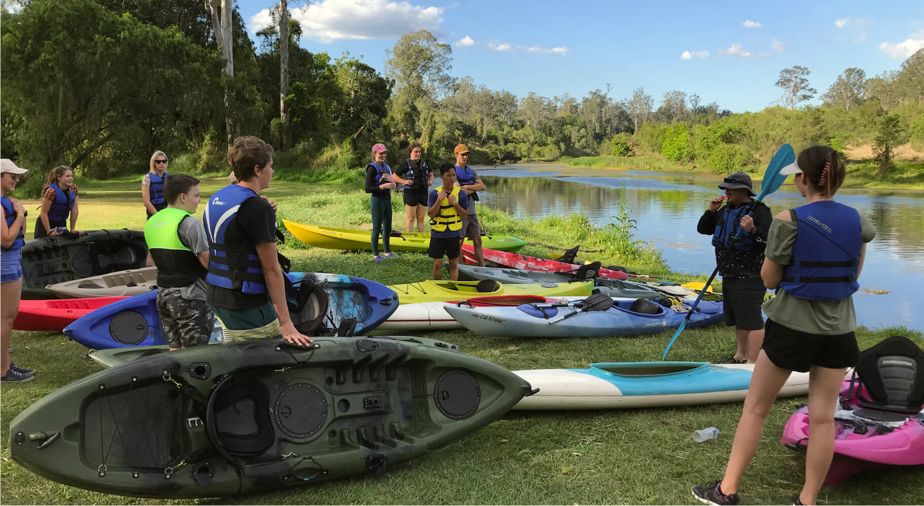
Media and Text
Display an image next to text using the “Media and Text” block. This content is static and specific to the page.
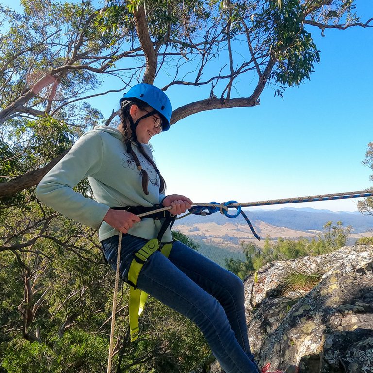
Media and Text
This allows for a reasonable amount of content to be placed next to the image, as well as buttons and other content. If the content for this area starts to get too long, separate out the paragraphs so the introduction is in the Media and Text block and the remaining content sits below.

Media and Text
Images can also appear on the left hand side, creating an alternating pattern down the page.
Heading
And this is a paragraph.
Lorem ipsum dolor sit amet, consectetur adipiscing elit. Mauris eu risus sit amet augue laoreet ultrices. In hac habitasse platea dictumst. Phasellus tristique odio quis sapien sodales iaculis. Vestibulum at varius ipsum, non volutpat ex. Nullam odio enim, tristique a est vel, pellentesque pretium mauris. Sed efficitur ornare tortor et pharetra. Pellentesque rutrum arcu id massa vulputate consequat. Pellentesque habitant morbi tristique senectus et netus et malesuada fames ac turpis egestas. Duis a dictum odio, quis cursus tellus. Nunc mattis urna nec felis tincidunt tempus. Aenean lacinia semper quam eu molestie. Etiam lacinia purus nec tempus pretium.

Buttons and Links
Buttons are generally yellow and should be used sparingly. If you find you need to link to several pages in one section, it may be best to use Quick Links instead, as these are visually less intense.
Links
Links to pages can be added within paragraphs by selecting the word you want to link and clicking the chain link icon. Links appear with an underline beneath them and are in purple. These are useful for linking within content and are unobtrusive. If you need to direct more attention to the link, it may be best to place a button below the relevant paragraph instead.
Buttons
Choose the button text carefully, it needs to remain short, but descriptive. Sometimes the best text to use is the name of the page you are linking to. Many buttons can be placed next to each other, but ideally, this should be no more than two. To link to a video, place the Vimeo or YouTube link in the URL field and it will automatically turn into a popup when clicked.
Quick Links
There are two display variants for quick links and they are dependent on the context that they are placed into. To add quick links to a page, select the “Quick Links” block.
Horizontal
These appear vertically in the editor, but display horizontally next to each other on the front end page.
Vocational Guidance Vocational Guidance Vocational GuidanceVertical
The vertical variant is used within columns – this creates an easily scannable vertical list of links and is a common pattern used throughout the website. It allows many pages that are relevant to the section to be featured, but in an unobtrusive way.
Heading
Lorem ipsum dolor sit amet, consectetur adipiscing elit. Etiam placerat at massa non vulputate. Nunc a sapien non neque blandit cursus efficitur ut urna. Mauris lacus augue, efficitur sed quam eu, molestie tempor nulla.
Staff Members
To display a photo grid of staff members, use the “Staff” block and select the relevant category in the block options. When a staff member is added to that category – or removed, the block will automatically update across the website where that category is featured.
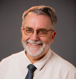
Graeme Johnston
Executive Principal

Corey Lun
Business Manager
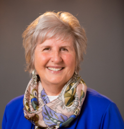
Rita Rosehr
Deputy Principal Curriculum P – 10

Douglas Stuart-Adams
Deputy Principal Senior School

Spacers
While we have some basic spacing happening between blocks, sometimes additional space is needed so that some blocks appear further away from others. This creates “groups” of content and can make it easier for users to associate what information belongs to each section.
These spacers change height across different screen sizes (mobile vs larger screens), so try to keep to these sizes, even though you are able to select specific ones.
Small Spacer
Medium Spacer
Large Spacer
Overlap
We can also use these spacers to create some overlaps. Below is a conditional overlap with cards and it requires the next “section” block to have a grey background and for the first block to be cards. This then pulls the cards up to overlap the section before it, but requires a spacer to give it a bit of extra breathing room.
-
Community
Faith Christian School of Distance Education is made up of a hardworking team of over 140 staff, a parent-run Board and a school community of over 1500 people.
-
Contact
Have a question? Want to chat to someone? Pay an invoice? Our friendly Admin staff will be happy to speak […]
-
Education
Faith offers non-denominational, co-educational distance education for students in Years Prep to 12, with a strong curriculum, dedicated teachers, and […]
Heading
Lorem ipsum dolor sit amet, consectetur adipiscing elit. Etiam placerat at massa non vulputate. Nunc a sapien non neque blandit cursus efficitur ut urna. Mauris lacus augue, efficitur sed quam eu, molestie tempor nulla.
Heading
And this is a paragraph.
Lorem ipsum dolor sit amet, consectetur adipiscing elit. Mauris eu risus sit amet augue laoreet ultrices. In hac habitasse platea dictumst. Phasellus tristique odio quis sapien sodales iaculis. Vestibulum at varius ipsum, non volutpat ex. Nullam odio enim, tristique a est vel, pellentesque pretium mauris. Sed efficitur ornare tortor et pharetra. Pellentesque rutrum arcu id massa vulputate consequat. Pellentesque habitant morbi tristique senectus et netus et malesuada fames ac turpis egestas. Duis a dictum odio, quis cursus tellus. Nunc mattis urna nec felis tincidunt tempus. Aenean lacinia semper quam eu molestie. Etiam lacinia purus nec tempus pretium.

-

Improve Your Career Through Distance Education
In our modern, fast-paced world, the demand for flexible and convenient educational options has never been more crucial. For many […]
-

How Distance Education Works: Learn the Basics
In the modern, dynamic world, education no longer remains confined within the boundaries of traditional classrooms. With the advent of […]
-

Choose Best School For Your Children
Choosing the right school for your child is one of the most important decisions you’ll make as a parent. It […]
-

Best Primary School in Queensland: Top Choices 2024
When it comes to choosing the best primary school for your child, it’s crucial to consider the various options available […]
-

Time Management Tips For Distance Education Students
Distance education offers flexibility and the opportunity to learn from home but also requires good time management skills. For students, […]
-

Distance Learning Advantages: Why It’s Beneficial
Imagine being able to attend school without ever leaving your house. No need to rush in the morning to catch […]

VET Courses for Faith Students
Faith provides the following Faith-created vocational courses. The courses involve practical tasks and limited essay writing.
- PDF ICT20120 Cert II Applied Digital Technologies
- PDF CHC22015 Cert II Community Services
- Video PDF SIS20419 Cert II Outdoor Recreation
- Video PDF ICT30120 Cert III Information Technology
- Video 10741NAT Cert III Ministry & Theology
- PDF CUA31020 Cert III Screen and Media
- Video PDF BSB30120 Cert III Business
- Video PDF BSB30220 Cert III Entrepreneurship and New Business
- PDF CUA41220 Cert IV Screen and Media*
*Cert III Screen and Media is a required prerequisite for this course.
VET Courses for External Students
Not a Faith student? Learn more about our course open to all students — Certificate III Ministry and Theology.
Certificate III Ministry and TheologyHow is Faith’s VET program different?
Not only is Faith’s VET program more affordable than comparable commercially-offered courses, all of our courses are taught by experienced Christian trainers through a Christian Worldview.